

My thoughts on Voyage
Voyage takes your eyes on a journey, with so much to discover! This display typeface designed by Jérémy Schneider from VJ Type is, made for short, large text – the large, the better. What defines Voyage is contrast – between the thin and thick strokes, creating visual patterns of words and lines.
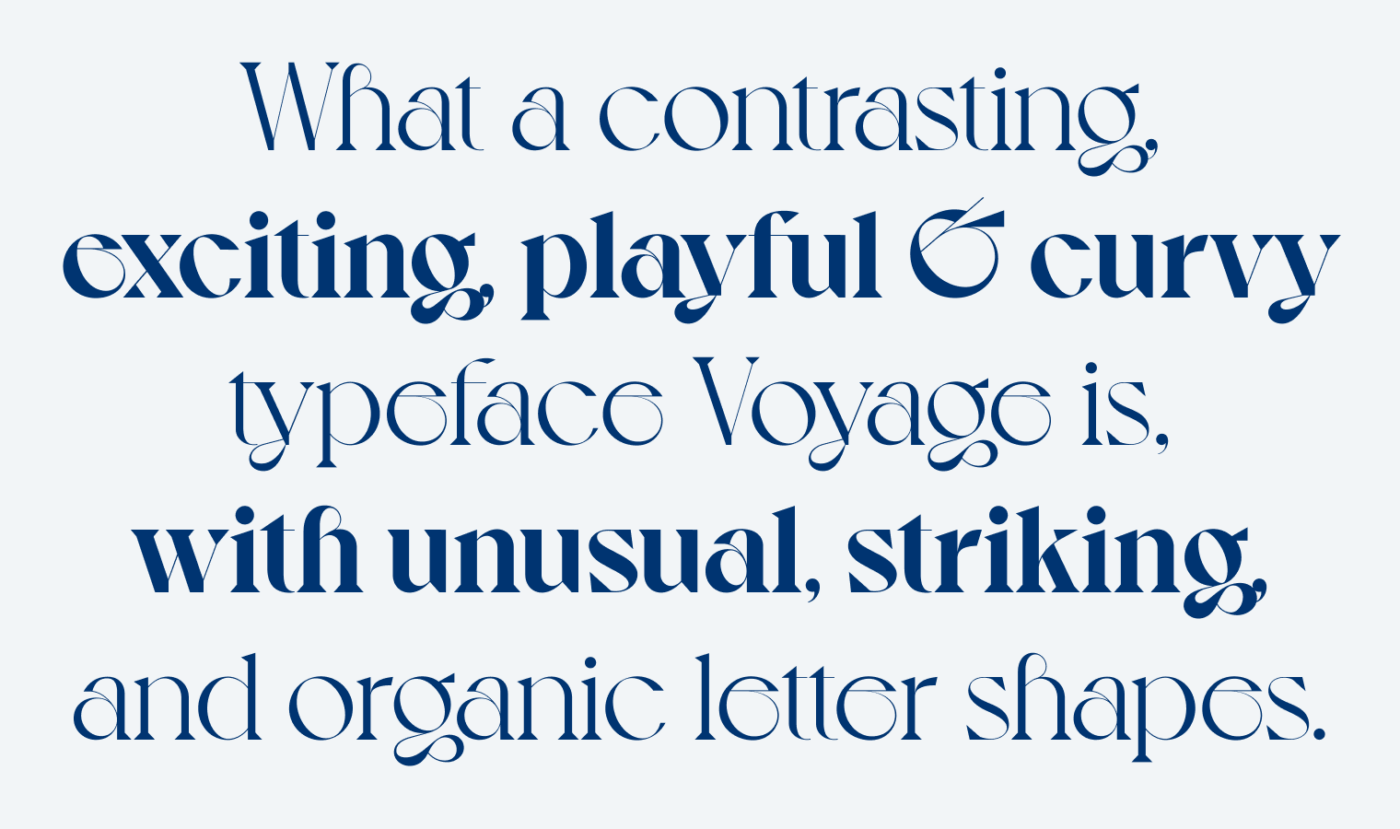
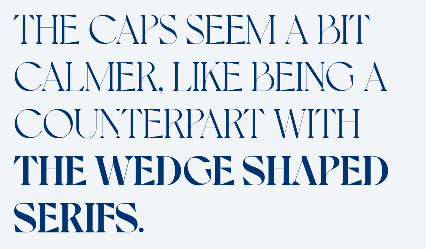
But there is also this contrast between organic and strict. You can see it with the almost rough or dull wedge serifs that are more dominant in the caps, playing a counterpart to the playful and soft lines. The E and H are super strict, the B and P very playful, again, reminding of Art Deco style.
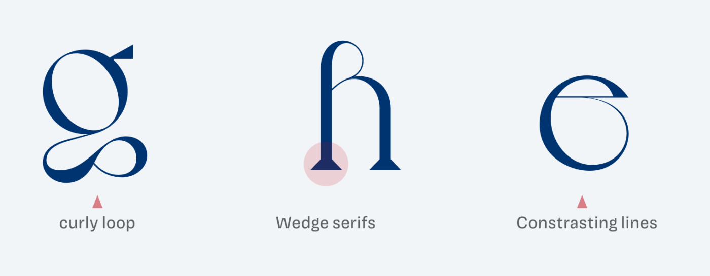
Very characteristic letters to me are the lower case g, h and e. The geometric, circular shapes, loops, the wedge serifs, and the strong contrast are all shown in these few characters. The typeface also comes with plenty of stylistic alternates, arrows and other cool glyphs, worth discovering.
Overall, an interesting typeface for a project that wants to be noble and contemporary, or fashionable while being unexpected.
What do you think? Is this typeface something for an upcoming project, or do you have a font recommendation? Tell me in the comments below!
Well, well, seems like everyone’s left on voyage already!
OK, I’ll speak instead 😀 Voyage, Voyage, how beautiful you are😍 you’re like a bow for a fashion show. Your dynamic curves and lines are dancing with headlines. My 👍🏻 goes to Regular and caps are not legible at the first sight.
If I was tasked to create a logo, h and g would be A MUST if the brand’s monogram has it in the name. Oliver, have you noticed how g is always in the spotlight? Letter with the most potential to be quirky and artful.
I’ll also take the chance to wish your family & you a cozy Christmas 🎄 May you become Santa so that all the wishes become true, not waiting for someone to bring them. 😳Make a plan, be the creator of your own life😉
Cheers to all the upcoming letters in the new 2023.!
The g ist very geeerful 😉. Take care, Jana! Thank you for all your engagement throughout the year!