
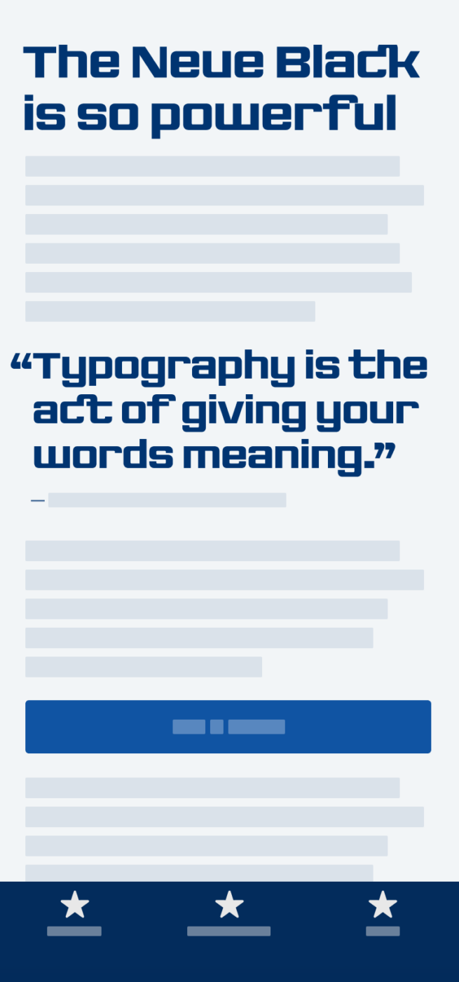
My thoughts on The Neue Black
I heard about Trés Seals, the designer of The Neue Black, in this podcast. The mission of his foundry Vocal Type Co. is to highlight stories of underrepresented groups of people through their catalog of historically-inspired typefaces. The Neue Black is based on the signage from the Chicago Freedom Movement, an advocacy campaign spearheaded by Martin Luther King Jr. and the Southern Christian Leadership Conference (SCLC).
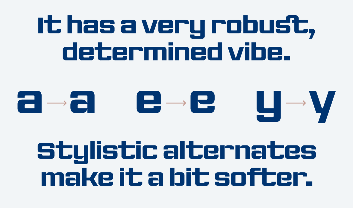
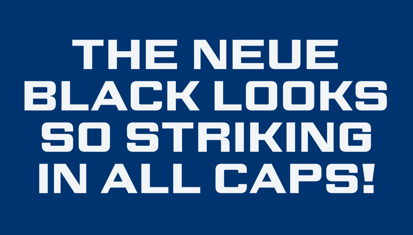
Besides loving the idea behind Trés Seals’ foundry, I like how squarish, at times imperfect, and yet impacting The Neue Black appears. It’s not super polished, it’s robust. And this perfectly fits to the backstory – being determined, resisting, and insisting. It is best suited for large, short display text. The stylistic alternates give it a slightly softer tone. And I think it shows all its glory set in all caps.
Recommended Font Pairing
Looking for a match for body text? The Neue Black is a rational, linear sans-serif typeface. If you want something more traditional, choose Besley. For something more modern, rational linear sans-serif, or Inria Sans would make a good match.

- Headings


Learn more about pairing typefaces using the Font Matrix.
What do you think? Is The Neue Black something for an upcoming project? Tell me in the comments below!
I appreciate the robustness of the Neue Black. Its masculine attitude but far from my personal style. I see its fit in a futuristic-tech-space, a true movie headline character.
Well, congratulations on your move Oliver! Thank you for being such a responsive and amiable host. 5 stars ⭐
Thank you, Jana, for regular sharing your thoughts here! And now emoji finally work 🤩
Thank you for sharing your knowledge and providing access to new fonts. I am fairly new to the world of visual communications, and looking forward to using the Neue Black font in some of my upcoming projects. I made a donation to the Vocal Type foundry help ensure their continued creative expression and support their mission.
Thanks for your kind words, Bernie! And it’s awesome, that you support Vocal Type’s Mission 🤘🏾