

My thoughts on Sporting Grotesque
Sporting Grotesque, designed by Lucas Le Bihan, is another gem discovered at Velvetyne, the libre & open-source foundry. It is inspired by the early sans-serif typefaces, which were not so polished and perfected yet. It feels very grounded, wide, with a calligraphic, organic touch.
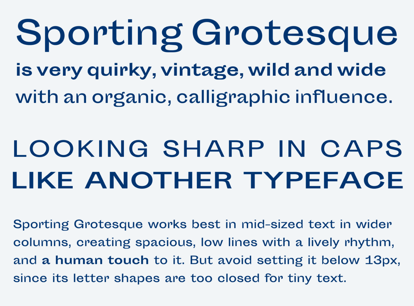
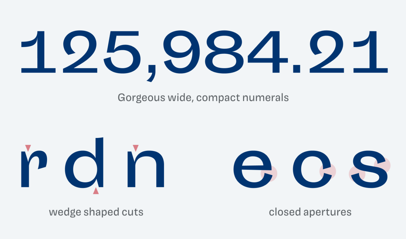
The typeface comes with plenty of idiosyncrasies. I adore the numerals, the flared terminals at the rounded shapes, and the distinct wedge shaped cuts. They make Sporting Grotesque very contrasting, while the wide proportions, large x-height, and short ascenders and descenders, make it appear very stable.
The spacing of Sporting Grotesque is peculiar as well. The letters are arranged relatively tight together, while the word space is pretty wide. It works best in smaller sizes (around 14 to 22px), but the larger it becomes, the more the lines start to fall apart. So you should adjust the word spacing here, as you can see blow.
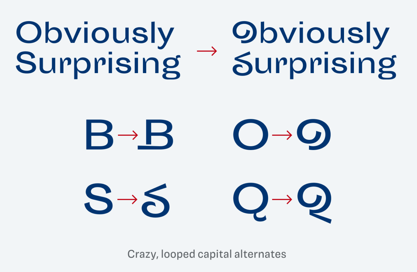
A very striking feature are the crazy capital alternates that come for B, S, O, Q. Not sure what to do with it, but in some cases you need to surprise and distract, especially with the broken S. What use cases would you come up with? I made a short video how to use stylistic alternates with CSS.
Overall, a unique typeface for a little body text set at mid-sizes when you want to create an artistic or vintage atmosphere. If you want to learn more about this typeface, I highly recommend Bethany Heck’s review of it, that goes into great detail.
Font Pairings for Sporting Grotesque
Sporting Grotesque is a rational, slightly contrasting sans-serif typeface. To calm it down, pair it for example with Rebrand or Familjen Grotesk for body text. But also Work Sans would work 😉 fine.

- Headings
- Copy


Learn more about pairing typefaces using the Font Matrix.
What do you think? Is this typeface something for an upcoming project, or do you have a font recommendation? Tell me in the comments below!
The aesthetics and versatility of Sporting Grotesque are aspects that I really appreciate. Although it is no longer available in Velvetyne’s directory, it can be accessed on GitLab. It is surprising that there have been no new attempts to expand this font in the last six years.