
My thoughts on Roba
I briefly know Franziska Weitgruber, the designer behind Roba, from a small alumni get-together years ago of our graphic design school in Austria. After that, I followed along her work, and fell in love with the striking type designs she made in recent years.
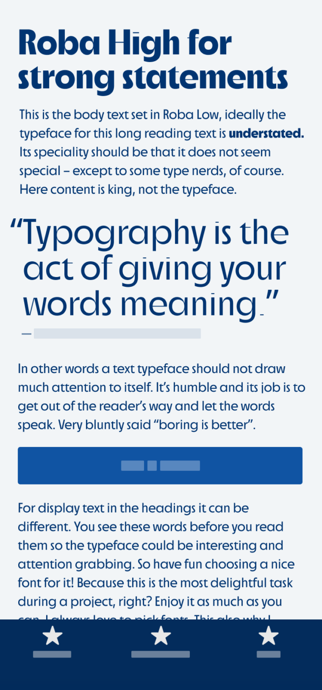
What I particularly like about Roba, this sans-serif display typeface that mixes the vibe of the 20ies with contemporary contrast, are the two different styles, High and Low. Roba High is so beautifully geometric, it can feel light as a summer breeze and the bolder it gets, the more character it shows, like a South Tyrolean wine. Okay, I’m making things up here, since I don’t really know anything about wine and South Tyrol, but I know Franziska’s from there 😜. Anyway, Roba High would perfectly fit for larger text in display sizes.
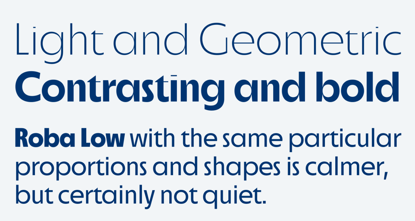
On the other hand, Roba Low is much calmer and suited for smaller sizes between 17 and 24 px. I would not use it for very text heavy applications though, but if it’s a website with only little copy, go for it! Both styles share the same proportions, have short ascenders and descenders, and a large x-height, which allow tight setting. Roba is still in progress and sold on Future Fonts, purchase it now to get the best price, and free updates until the typeface is finished.
Font Pairings for Roba
If you are looking for a calm body text, I recommend pairing it with similar but cool Capitana or friendly Gabarito.


Learn more about pairing typefaces using the Font Matrix.
What do you think? Is Roba something for an upcoming project? Tell me in the comments below!
Der Low-Schnitt gefällt mir gut. (High ist mir zu experimentell für meine Sehgewohnheiten.) Nur das “R” sieht mir zu sehr nach Frutiger aus und hat eine zu unspektakuläre Form, finde ich.
Ist die Schrift denn für Web verwendbar? Auf FutureFonts steht, das Hinting sei noch nicht bearbeitet …
Hey Markus, laut Franziska enthält bereits eine Lizenz auch schon Web Fonts enthält. Kann sein, dass das dann noch optimiert wird, dann müsstest du im Prozess die Schrift ersetzen. Aber bei genaueren Fragen wenden dich am besten direkt an Franziska.
Okay, danke für die Info!
Roba High/Low stolen mine heart. It’s somewhat fashionable, reminds me of “The Great Gatsby”, Oliver! Absolutely in love with both styles.
I don’t like naming “Roba” but that’s not a type designer’s thing anyway. Franziska did a great job. I can imagine combining it in some fashion collage, editorial… Roba High for headings, magical🤩
Happy I could guide the way to this loveable typeface for you, Jana 😍