
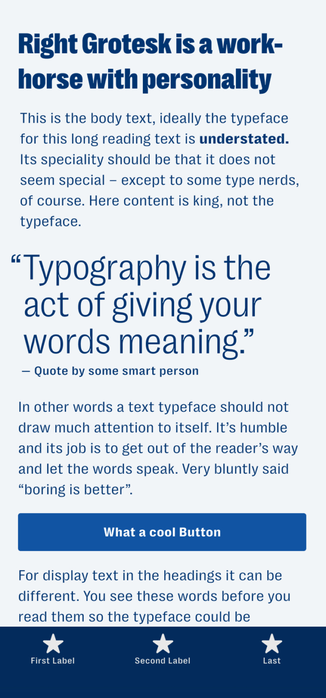
My thoughts on Right Grotesk
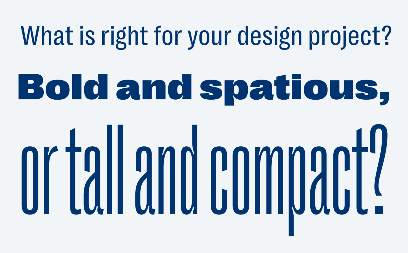
I’m constantly on the lookout for nice sans-serif fonts for my app designs. Yes, we all know Apple’s default font San Francisco is great, but it just lacks personality (which it should as a default font). This is where Right Grotesk comes into play. With a vast collection of 130 styles, it can be a true workhorse typeface for functional text in your UI or long reading text, but also attention grabbing for display text. The extremes make it so interesting to me, and this is why I recently picked it for an app design for a client, which I’m hopefully allowed to show here soon.
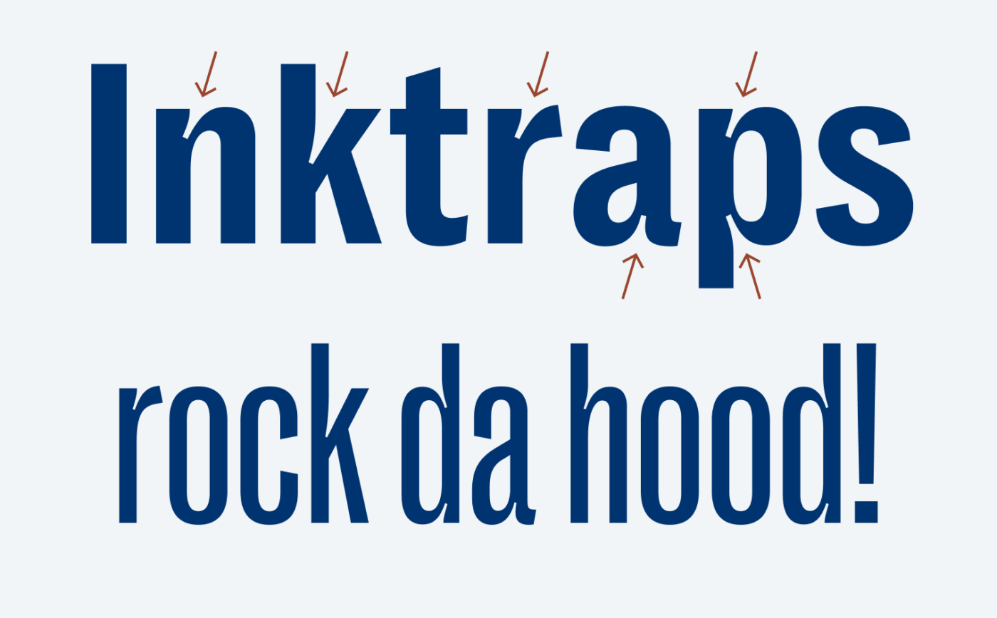
What particularly stands out are the exaggerated ink traps, which came into fashion some years ago, and I first realized with GT Zirkon. Lookin at them fills my heart with delight, and I like how you can still feel them in the light and narrow styles.
I appreciate the free demo fonts for personal use, containing naturally not every, but enough styles to try it out. I also want to highlight Pangram Pangram Foundrie’s very granular licensing, starting at just $ 30 for app or web integration per style. This makes distinctive typography affordable for smaller projects even. The downside is, that it gets very complicated soon, because you have to purchase a lot of licenses, even a separate one if you want to use it in a logo, which is rather unusual. So for larger clients, it might be a bit complicated to explain and cumbersome to always monitor the number of users or page views.
What do you think? Is Right Grotesk something for an upcoming project? Tell me in the comments below!
It’s very nice indeed. I especially like the light styles. As for the bold ones. These ink traps look a bit weird. They make the font look like a hippie font. Some letters (d, b, u etc.) look a bit like flared jeans from the 60s.
😂 love that comparison with the jeans, Doctor Z.! Yeah, they are the trendy part we might feel weird about in some years. But that’s how fashion is, I guess.
Actually, I had a hard time reading body text in Right Grotesk. Its beauty is in quirky ink traps and it is the most attractive in narrow&tall style. This kind of font best suits big brands. Agencies like Pentagram take a font like this (many styles, a dash of character) and adjust them into a brand system.
When I read “sans serif” in the intro I thought it’s a mistake ’cause Right Grotesk at first glance doesn’t look, for what we’re used to nowadays, sans serif. A/A for personality and style family.
I’ll take into consideration that here, in your brand blue, it looks more “casual” with all its personality. But imagining it in black, it’s a totally different mood and more stubborn effect.🙄
That’s a good observation on the blue-to-black difference.
Yeah, Matt! I agree with Jana, it lacks a bit of contrast to make it easy to read. I should have used a stronger weight or a darker color.
Great point, Jana, colors have a big influence. And it does not look like nowadays soulless sans-serifs. I guess that’s why they called it Grotesk since it’s inspired from these early, quirky first sans-serifs around the late 19th century.
I’m glad I’ve been of help here as a regular reader 😉
Oliver, look who is here “The primary typeface is Right Grotesk by Montreal-based foundry Pangram Pangram, and appears in various styles and weights as a nod to the venue’s vintage exhibition posters.” Your star show, Right Grotesk in action 👉🏻https://www.creativereview.co.uk/olympia-london-branding/
Oh, cool! Thanks for sharing!