Learn how to improve the typographic visual hierarchy of a page, and better guide your reader through your content. This is a great example to see how much difference small changes can make.
Thanks to Caleb, who sent in his site for typographic review! Watch the video here.
Key takeaways
- Give your elements sufficient space.
- For your link styles in the body text, make them as subtle as possible. Find a balance between being noticeable and distracting.
- If your text is different, then style it accordingly (the footer should contrast with the article’s content itself).
Analysis of the current design
- The used typeface Georgia is not bad, but not unique either.
- Header and navigation draw too much attention to themselves.
- Header and h1 compete with each other, they are too close.
- The colorful links in the body text are overemphasized, which make it hard to focus.
- The footer with the meta about the article is not visually separated from the main content itself.
- I love Caleb’s focus state and how obvious it is!
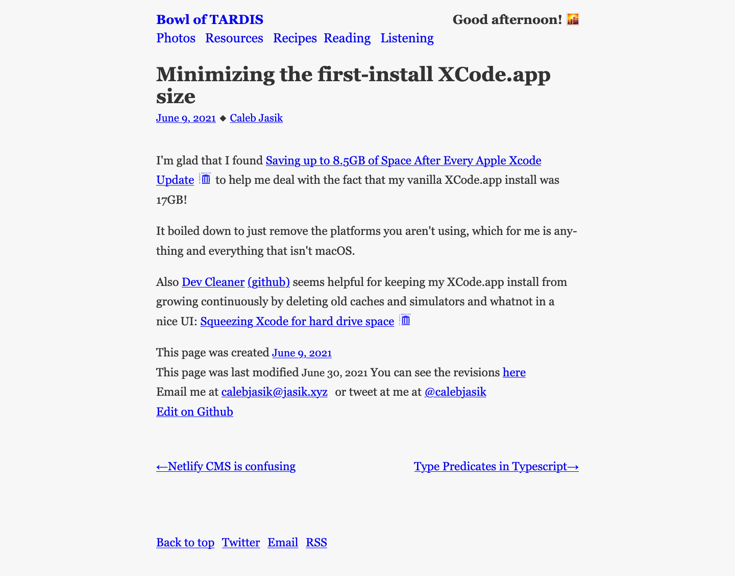
My conclusion: It’s not clear what’s the most important element on the page, which makes is hard to dive into the content.
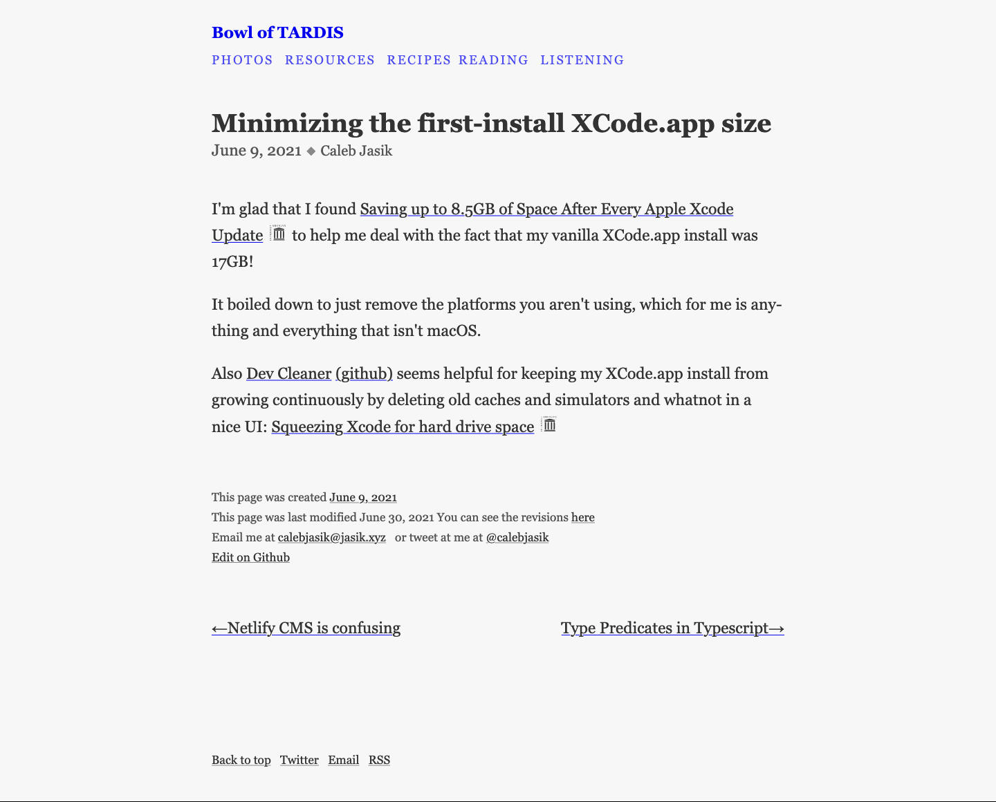
What I pimped
- Header and navigation are now a bit smaller and differentiate better from the rest of the page.
- The “Good Afternoon” greeting message from the top right got removed, since it was too distracting.
- Distance between the header and the h1 got increased.
- The font size of the h1 got slightly smaller (from 1.7 to 1.6 rem).
- The links below the h1 are in gray and not styled (they don’t need to stand out that much here).
- For the links in the body text, I removed the color, except for the underline.
- The footer is now set in a smaller font size (to around 75% of the body text).
What do you think about my improvements? Let me know your thoughts in the comments! If you want to, you can send in your web or app design for typographic review here as well.
Simple a very very effective. Now my soul (…and my 👀) can take a rest. Good work Oliver!
😅 Thank you, Caco!
Bin gerade auf das folgende gestoßen https://brailleinstitute.org/freefont
Vielleicht interessiert dich das
Ja, der ist voll cool und auch voll interessant! Danke für’s Teilen
I saw that font yesterday! It definitely looks quite nice as a font to use, though I think I’m leaning towards Addington from https://jasik.xyz/fonts … https://connary.com/addington.html
Nice one, Caleb! Thanks for sharing, definitely try a demo for your Blog and let me know when you did!
Hi Oliver,
falls du dir die Schrift schon näher angesehen hast, würde mich deine Meinung dazu interessieren. Beispielsweise ob die Lesbarkeit dieser Schrift wirklich besser ist
beste Grüße, Lena
A textbook before/after example – so much of the revision is about recognizing and using emptiness or negative space.
Thank you, Matt! ☺️
Just a suggestion for a future article. It would be interesting to know what fonts and styles you see being used in design trends for 2022. I suspect we will see more outline fonts, stretched fonts and animated text.
Great suggestion, Ashley! Thanks for the input, I’ll think of something like that!
I thought for accessibility you need to do more than underline links in body text? Does the gray provide enough contrast with surrounding? Thinking for cognitive or moderate visual impairment. Would be interested in your take and suggestions to meet all the WCAG on this issue.
Thank you for that question, MZ! I had to check this again, but it’s the other way round. You should not just use color to distinguish your links from the rest of the body text. Means you should at least underline it. Regarding the color, it comes down to the suggested contrast ratio, and you’re right! The footer test ist too light with a contrast Ration of 3.6:1. It should at least be 4.5:1 to pass AA. This means instead of
#808080it should be#707070.