
My thoughts on Larrikin
What describes Larrikin best is the text on its website: “Larrikin is an Australian term meaning y mischievous young person, uncultivated, rowdy but good-hearted.” This free font (for personal use) by Polish type designer Kaja Slojewska shows a young typeface, standing out, being loud, with some letters behaving inappropriate – but so adorable for its quirkiness. I love the g, I love the slab-serifiness (yes, this is a word), blobbiness and goofiness about it!
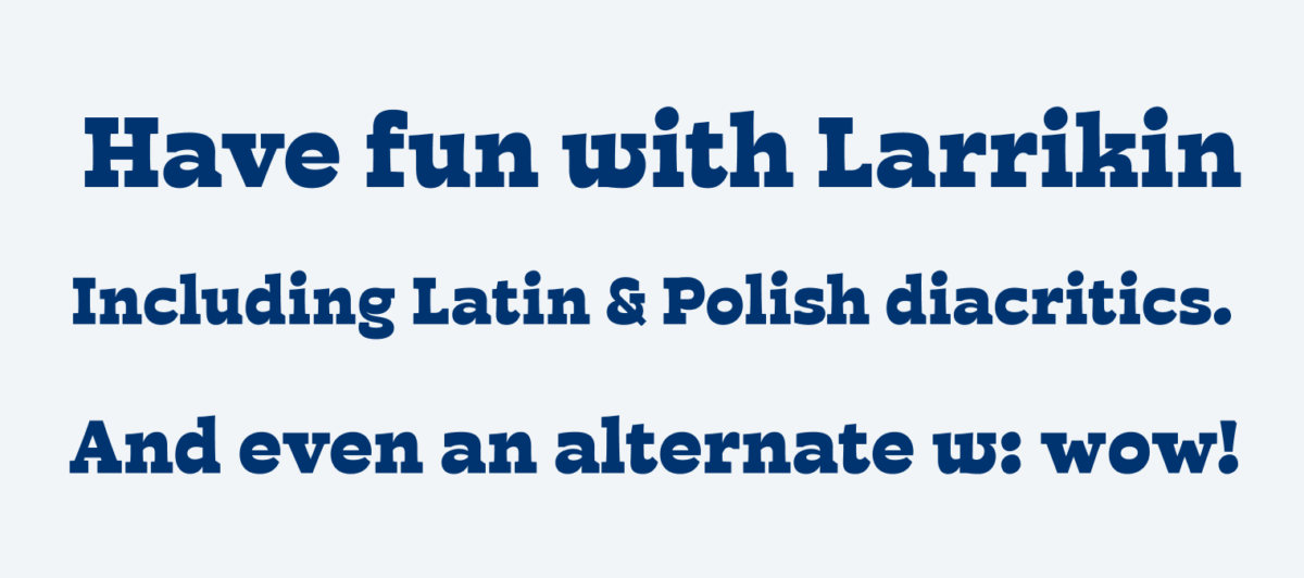
It’s truly a display font, best used for short and large text. Bear in mind that the character set is still pretty limited, only covering English and Polish. Some punctuation marks are still missing too (like proper typographic quotes). But as the name says, Larrikin is still young, and maybe the character set will grow someday? If it does, hopefully without loosing this playfulness.
Recommended Font Pairing
You are looking for the right companion for body text? Pair this strong, organic slab-serif with geometric Captura Now, or even softer Stadio Now or Campuni.

- Headings


Learn more about pairing typefaces using the Font Matrix.
Larrikin is completely opposite to my style however, it’s so different from most of the types on the scene. And this is a compliment with 5 ?! I’d definitely use it in projects where appropriate. Oliver, I don’t like an alternate w, the original quirky one is the utmost star.
Thanks for your thoughts, Jana!
P.S. In my previous comment I put an emoji “star” next to 5 but it is displayed as “!?” Just to make it clear, it has a positive connotation.
Yeah, my blog unfortunately still lacks emoji support. As it turned out, it’s not that super easy. But it’s on my to-do list.