
My thoughts on Garino
If you follow my FontFriday recommendations for some time now, you might know that I really appreciate Grotesk fonts. To me, Grotesks are the cool kinds among the sans-serifs. Current designs are referring to the early sans-serifs in the late 1800s, when not everything was that polished and soulless (like Hellvetica). I like that, because it gives you an opportunity to pour a little more spirit and expression into your digital projects.
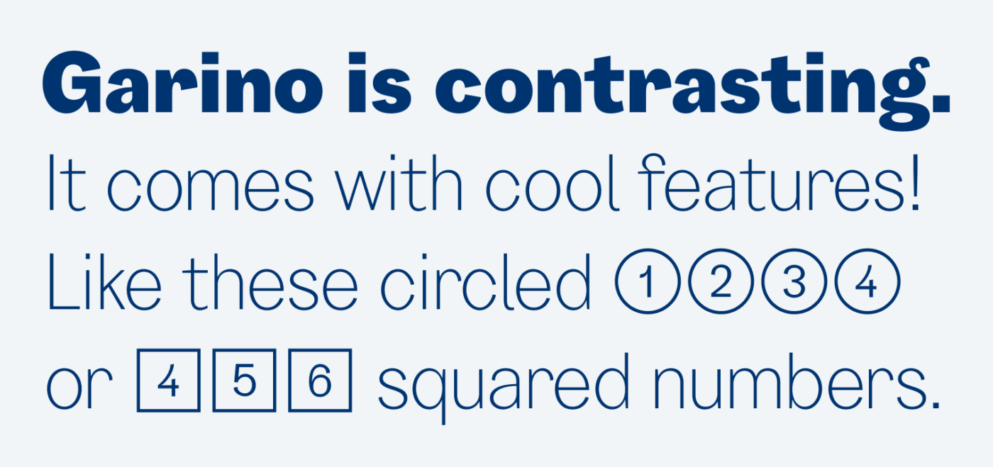
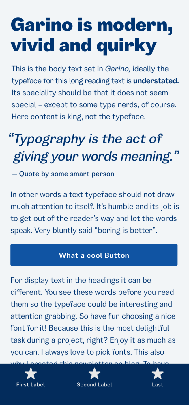
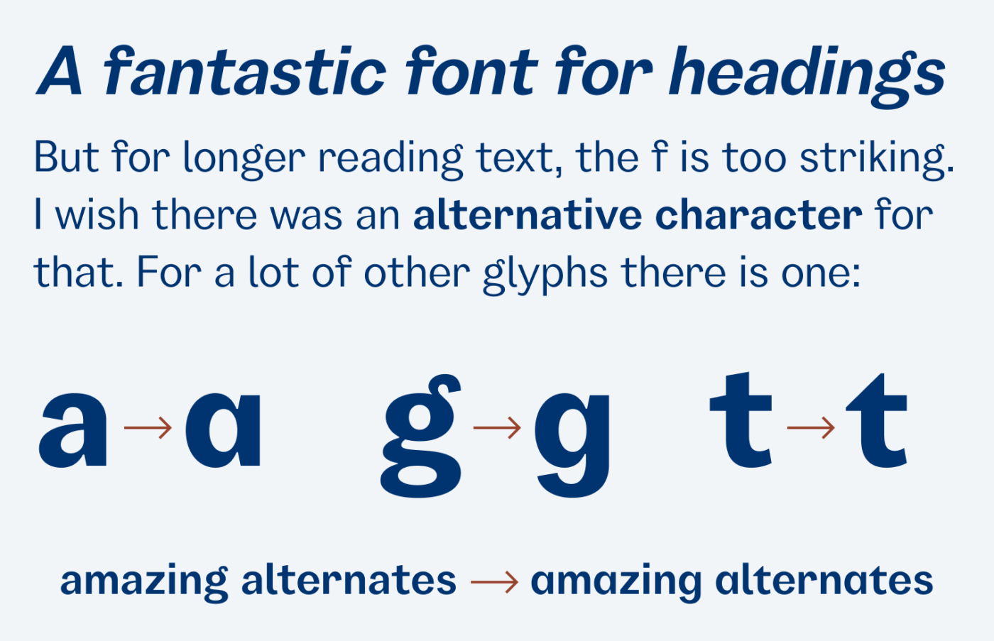
Garino by Julien Fincker is a well-equipped sans-serif font family. It can be elegant in the light weights and contrasting in the stronger weights. This typeface has its own quirks, like the hook on the f, that reminds me of the classic typeface Windsor. But what gives Garino its uniqueness can also turn into a weak point, when it comes to long reading text. Take a look at my sample body text in the phone example above, and you’ll see what I mean. In these situations, it’s too striking (especially in the last lines). Even though there are alternative characters for the lowercase a, g, t, and u, but for the f there is none. Nevertheless, if you apply Garino in a user interface or on a website that’s not super text-heavy, it could be a great choice!
Font Pairings for Garino
According to the Font Matrix, Garino is a rational, linear sans-serif typeface. If you need something similar but more organic for headings, use Fraunces or wild Faune.


Learn more about pairing typefaces using the Font Matrix.
What do you think? Is Garino something for an upcoming project? Tell me in the comments below!
Oof, this one is as pass from me. The lower case f makes me physically uncomfortable. It’s like I’m looking at a glitch in the matrix happening as I’m reading, and my attention totally gets caught on it. The rest of the letterforms are truly darling for the most part, the exceptions being the ampersand and the descender on the lower case y. (The y descender just feels off due to the thickness tapering a bit towards the end.) I dunno, I just really can’t jive with this one. At the same time, the majority of it IS super cute. Defo great inspiration!
At least I could challenge you a bit, Kace 😉! Yeah, the y’s decscender is a bit too emphasized as well. But all this is okay if it’s in a display context. I just would not market or use it as a workhorse type for all kinds of applications.
Garino is some clumsy, gauche guy, Oliver. 🤷🏻♀️But he can make a living of Headings in some artsy publishing!
Haha! Well, it all depends on the project 😉.