
My thoughts on Clear Sans
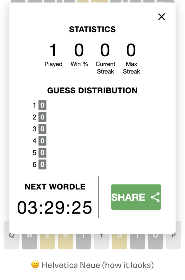
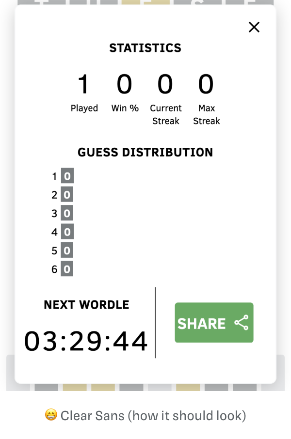
If you are a long-time subscriber, you might be already familiar with this week’s pick. I first discovered the free font Clear Sans, when I found out that there is an intended Wordle Font, nobody can see. Since this still remains a hidden gem, I wanted to give it a little more attention and point you to it here as well.
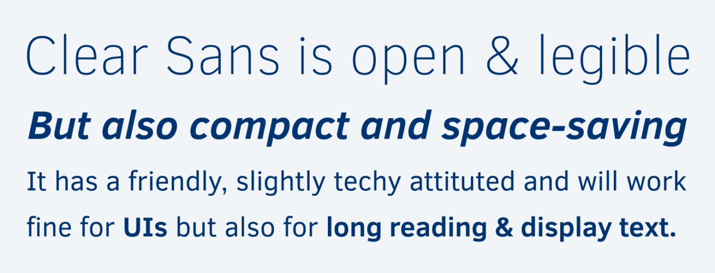
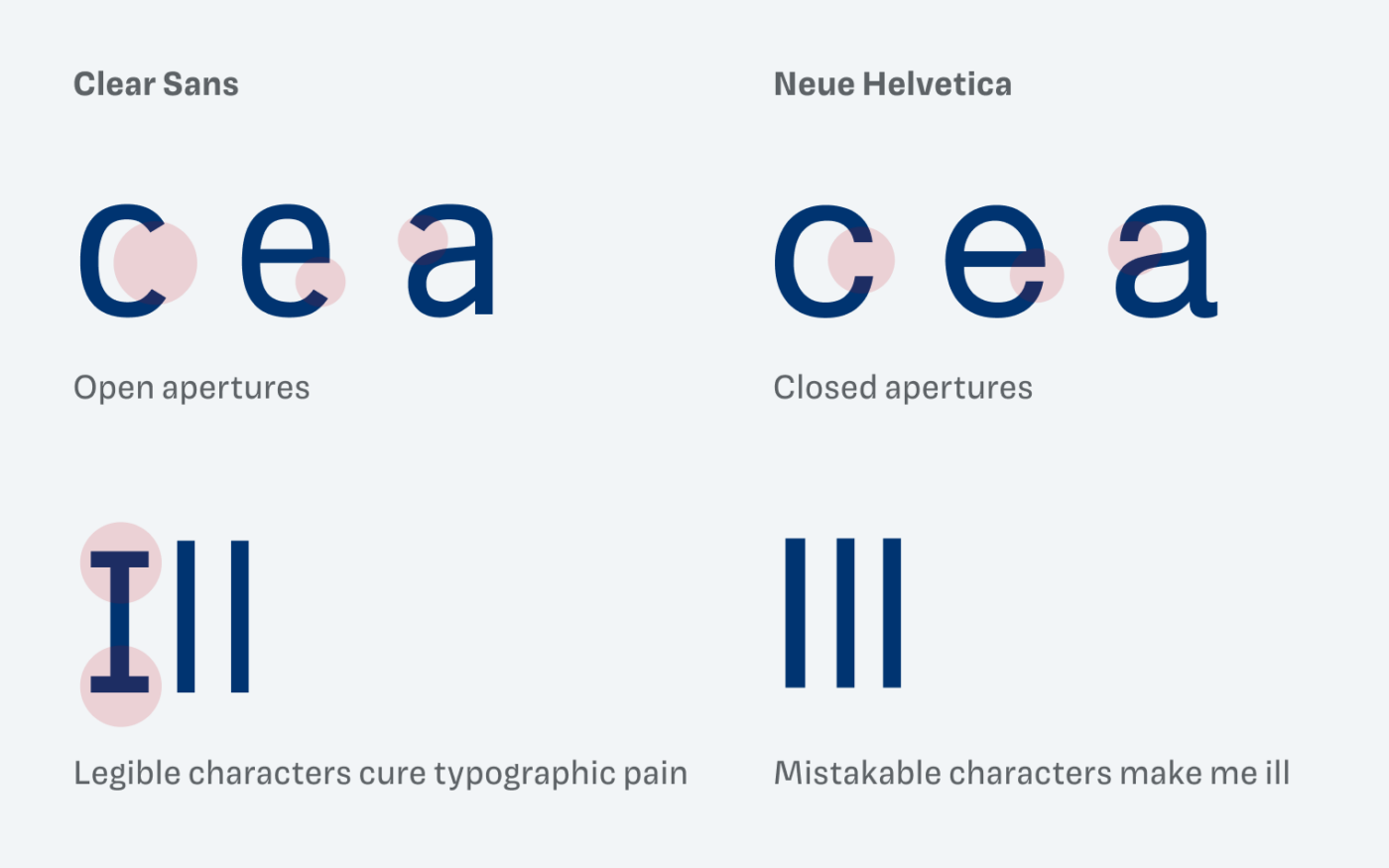
Clear Sans was designed for Intel and brings everything you need from a highly legible typeface, optimized for screen display. It hast distinct letter shapes, a sturdy stroke and is rather narrow. All good things when it comes to small text and/or lower resolutions. Compared to Hellvetica it clearly (lol) wins.
You can also see how this matters when applied on an actual project. See this example from my Wordle article:
The typefaces supports a wide range of languages using Latin, Cyrillic, and Greek scripts. A tiny downer is, that Thin and Light weights don’t come with italics. But overall a really cool font, and a serious alternative to heavily overused Open Sans 😉.
What do you think? Is Clear Sans something for an upcoming project, or do you have a font recommendation? Tell me in the comments below!
Very nice font. How to apply it to my wordpress site?
So easy Magda: use Custom Fonts plugin, please search in WordPress repository and follows the steps to implement it. 😉
Glad you like it, Magda! How you can integrate it depends on what theme you are using. Sometimes the themes offer the possibility to upload custom fonts. I’d recommend looking into your theme settings or for a plugin as Caco already suggested.
Thanks for hyping this font up. I think we going to try this font with a few of our website projects.
That awesome to hear, Dann!
I clearly remember a Clear Sans and it’s even more clear …😃
I’ve never been a fan of Helvetica, ever. Never understood the craziness about that typeface. But to be honest, Oliver, Clear Sans is soulless to me. With sturdy strokes, oook… Very tech, and cold, but I love the narrowness in it as well as soldier h, n, m, army like letters? They remind me of my, from time to time, reserved clients. Know those that can’t stand constructive feedback? Yep. Distance, please!
Clear Sans CLEARLY works its purpose, especially UI. Btw. speaking of UI, I’m a big admirer of Segoe UI. I’d love to see your review on it!
P.S. Thanks to you, I’m spreading my type database. And when a project pops up, this will come in handy for UIs, no-brainer!
Yeah, Clear Sans is definitely more restrained and less interesting. But that makes it a great candidate to pair it with something very striking 😉. I’m a fan of Segoe UI as well! I’ll consider it for the future.
Clean and fresh! Love it!
Absolutely, Caco! Let me know if you use it in a project 😉.